World End Economica, thusforth referred to as WEE, is a series of visual novels kickstarted by Sekai Project in 2014. I haven’t read them, and don’t know much about the series, but a post on the site about an “HD Remaster” caught my eye. What sort of game produced in 2014 isn’t HD from the start?
As it turns out, it was, and the ‘remaster’ is rather confusing on a number of fronts.
Background
The first point is confusion is that the original is, indeed, HD. The CGs are 1280x720, and looking at the other assets the game was clearly mastered at that resolution. As far as I can tell, what they mean is they’re porting the game to Unity and mastering at a resolution of 1920x1080, or Full HD.
From the start, I have reservations about this. Generally, when people try to upsample something in advance, the result is less than stellar. It’s better to just play a game at original resolution, and not leaving OSX and Linux users with that option is less than ideal. Optimally, the assets would be left at their native resolution and then upsampled if necessary as the game is run. That said, if the originals were drawn at a much higher resolution, then releasing closer to that would be good! It depends largely on the original, and admittedly in a lot of cases eroge is mastered well beyond the final game’s resolution.
With that said, the original did have some issues; a lot of images had noticable compression artifacts and some of the original games’ OPs and EDs were bitstarved MPEG-1 files, and thus looked like garbage. Also, obviously, porting to Unity allows the game to be put on a whole host of different platforms, including consoles.
So ideally, the port would consist of an improved UI/engine, higher-quality images at 1280x720, and better version of the various video files, preferably in a newer codec.
Anyway, at this point two update posts have been published. They reveal some information that gives a better idea of what all’s going on, for better or worse.
Update 1
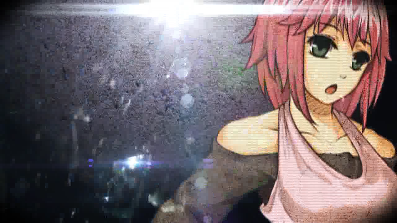
The first update post included a link to two images, cgs, as an example of the upscale. The images are here and here. The moment I opened them, something stood out very obviously – they’re dithered1. Someone please clarify if this is incorrect, but there doesn’t seem to be any valid reason for this. It’s possible that was done to reduce the color palatte and allow the images to load faster, but that seems to be a rather bizarre choice when you’re attempting to show off image quality. It’s also possible that was done automatically by Kickstater, but a cursory glance at other images would not indicate that’s the case.
Of course, it’s possible the originals were just saved in this format and there’s nothing they can do, right? To check, I grabbed a copy of the second game, where the screenshots are from, and extracted the assets. Here and here are those same two images, as extracted from the game, with a noticable lack of dithering.
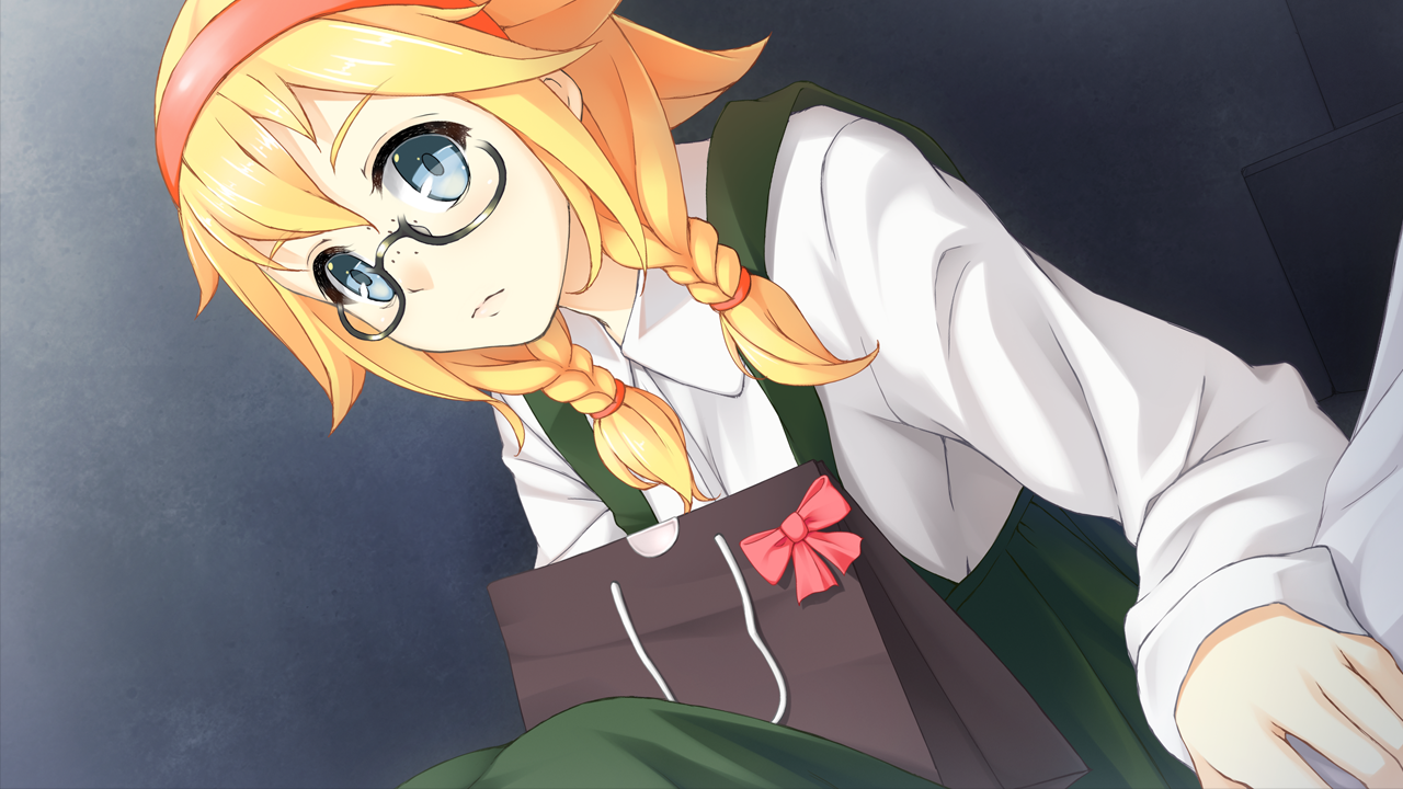
Also rather curious is the difference in colors. I can’t know for sure whether or not the original or the port is incorrect, though the dithering leaves me inclined to think it’s most likely a fuck-up on the part of whoever’s doing the port. It’s also possible the difference is just a product of the dithering itself; I can’t really tell. Finally, the crop doesn’t seem to be quite the same, though that’s not really a big deal.
Update 2
The second update post gives more of an idea of how exactly they’re going about handling the images. They make clear that they’re taking the original assets, re-compositing the various layers, and then exporting. This means they could potentially export in a higher quality than the original, minimizing issues caused by compression! Additionally, they confirmed multi-language support, which is a nice upgrade.
That said, it’s not all positives. For one, seems to indicate that the original was 1280x720, which would indicate that their version is in fact an upscale.
Then things get a bit stranger. They show an example of an uncropped CG, which is cool, but then say its resolution is “UHD”. This is actually a video term, but at this point it’s been co-opted into a meaningless marketing term that generally means a vertical resolution of 2160 pixels. Their wording, however, would indicate that’s not the case at all. Judging by the crop, it’s only a bit above 1080.
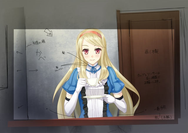
All in all, while the port is interesting some aspects of it are decidedly strange. If the final version includes the dithering/messed-up colors, though, I’d be demanding my money back2.
Footnote:
-
1: Dithering is essentially the process of adding noise to an image in order to create the illusion of color depth, or a color that couldn’t otherwise be displayed. This was much more useful back when screens were limited to 256 colors, but for something like this the gradient should be smooth. If you can’t see the dithering, look at the strap in the first image from the Kickstarter update; it’ll look like a bunch of noise in place of a smooth gradient. ↩
-
2: Since this was done through Kickstarter, so that’s most likely not possible. Aren’t requisite preorders the best? ↩